
Bizzy
UX UI Design Project
The Brief
Improving the current app, so that it’s considered the “go to” app when scheduling and planning outings with friends. The company would also like to gain social media presence and grow active users.
The Background
Bizzy is a social scheduling app created by Erick, Neil and Joey. They wanted a scheduling app to make the anxiety driven task of creating, sending, and even receiving invites more fun and personal.
The Problem
Although the app was created to make it easier and more personal for users to make plans with their friends and loved ones. The current users are faced with confusion of terminologies, and the functions of apps.
The Solution
Help users to use the app in a fast, effortless yet personal way, as well as minimizing any confusions that may arise.
Project Info
Team: Cicy Hou and Dana Chen (Me)
My Role: Heuristic evaluation, Comparative & Competitive Analysis, Interviewing, Affinity Mapping, Journey map, Design Studio, User flow, Task Analysis, Sketching, High Fidelity design and Prototyping.
With a smaller team, both of us collaborated on all aspects of the project.
Tools: Sketch, Principle, Excel, Google Slides, Illustrator
Platform: iOS App
(Android version will be developed by the end of the year)
Timeline: 1 week of research, 2 weeks of design ideation and prototyping at General Assembly
UX Process - Double Diamond

In this project we were able to complete the UX process by using the Double Diamond.
Once we understood the problem Bizzy was facing with the shareholders, we were able to complete each steps of the Double Diamond: discover, define, revise the problem statements, develop and then deliver a MVP to Bizzy’s CEO, CBO and tech advisor.
Step 1: Research

Comparative & Competitive Analysis
By conducting current calendar apps out there, it gave us insights that allow us to see what the current standards are.
We compared Bizzy to the following:
Any.Do
Woven
IRL
Timepage
Google Calendar
Cozi
We noticed that they all had common features but no one had everything. The common features were contacts sync (the ability or to skip), calendar integration, create a to-do list, and having a profile.
With this we could identify what were some of the opportunities to improve Bizzy and make it stand out.
Interviews
We created a qualifying survey to target Gen-Z and millennials. From those who qualified, we interviewed 9 candidates then proceeded to affinity map their value statements to see trends and patterns in a visual way.
We were able to further understand their lives, their habits, and to see what they deemed as valuable/important in a calendar app. We also conducted task analysis where we ask the user to use the current app to complete a task. In this case, we asked them to sign up, create a “spark” and convert it into a “buzz”. It unsurfaced problems with the current app which informed us as to what to stay away from in our development of the app.
After gathering the data from those interviews, we were able to create an affinity map and group their thoughts into categories that helped show what we should prioritize and to craft our persona.
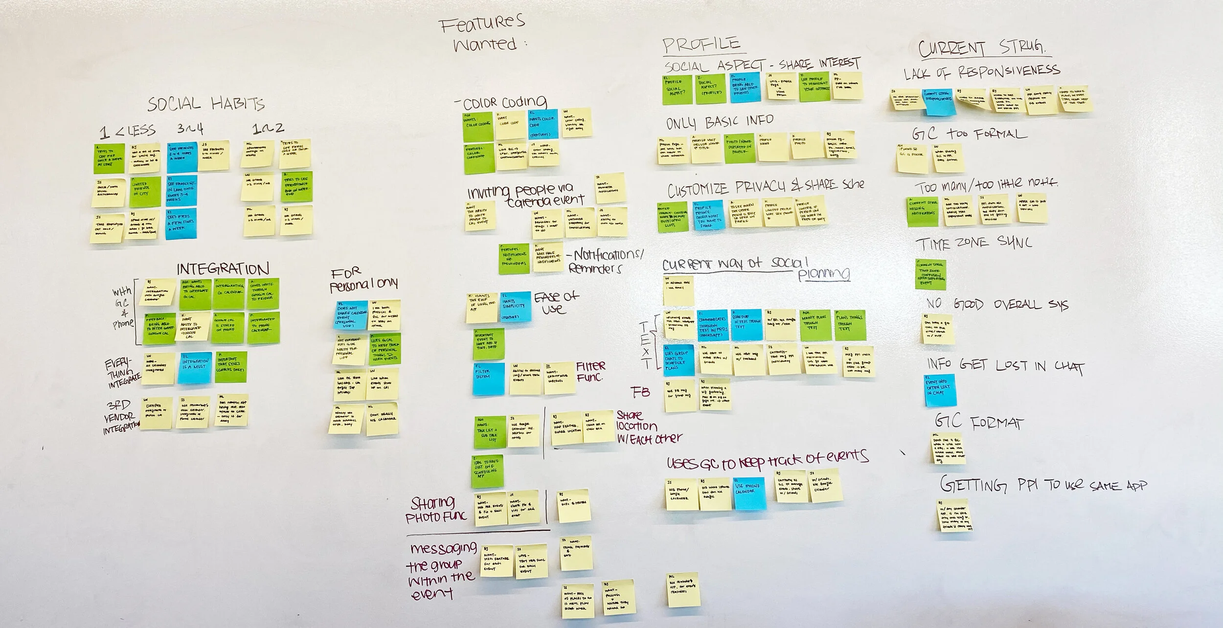
Affinity map helped us organize users’ preferences, motivations, and pain points. It identified trends, themes, areas of opportunity for discovery and improvements.
Persona
With the data that we gathered, we compiled two personas that exemplifies the motivations and frustrations of Bizzy’s targeted users.
After synthesizing all the research data and keeping our personas in mind, we began our design phase.


Step 2: Design

Feature Prioritization
The affinity map also allowed us to categorize what users wanted and how to prioritize their needs. This led us to create a guideline of features that users wanted in a calendar app.
We concentrated on the following features: facelift of app, update and incorporate new features in tab navigation, clarify confusion around terminologies by renaming them, simplify flows to help users achieve their goal quicker with ease and create a profile page.
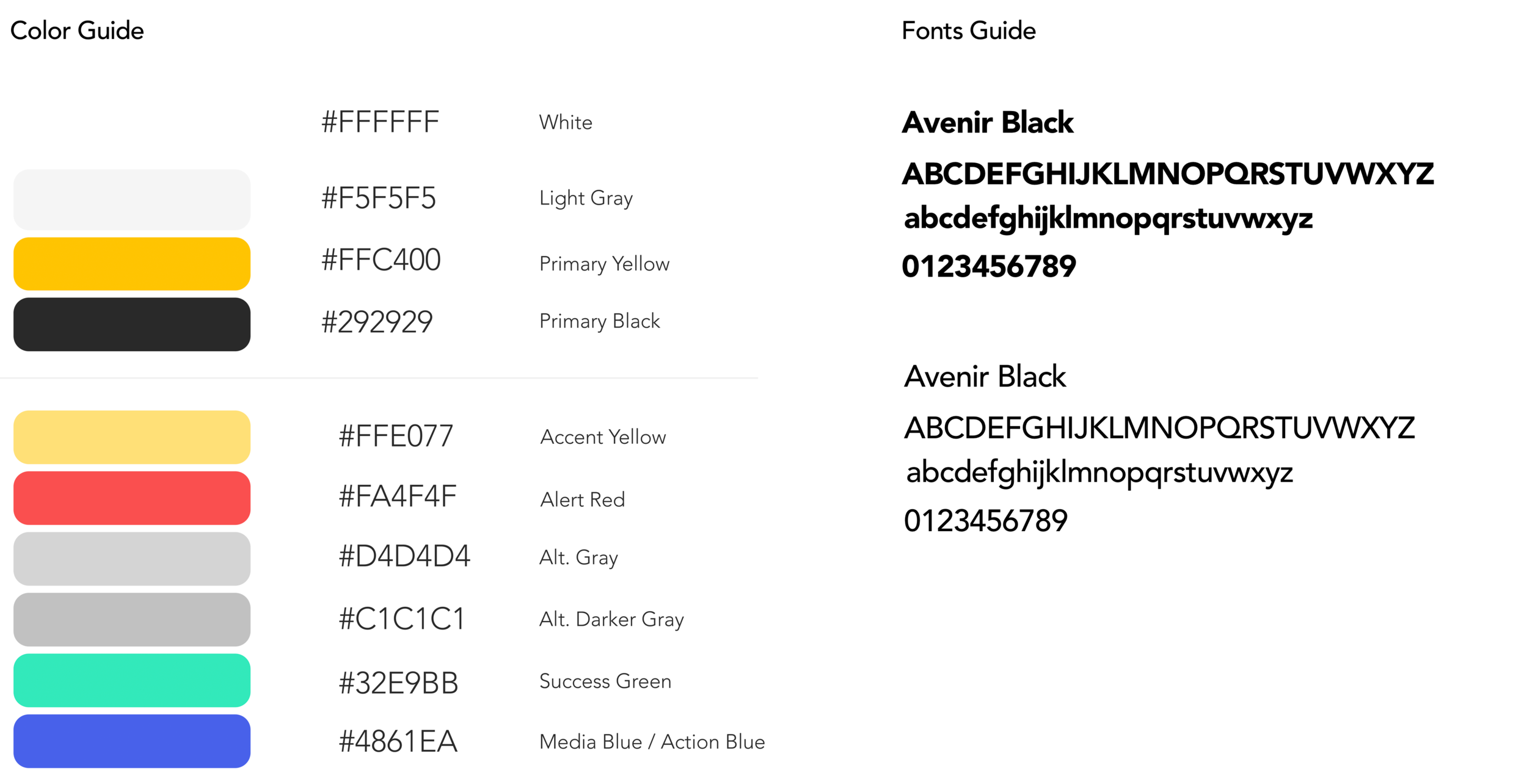
Brand Guide
Based on the existing brand, we redesigned the app while still using the current brand guidelines but gave it a modern, simple and clean feel to it to include Bizzy’s wide range of users.
Design Studio | Sketching
Before we got into sketching, we had a design studio session where we were able to explore a wide set of ideas and create a shared vision to move forward within a short amount of time. It incorporates brainstorming, critique, and prioritizations into a condensed session.
Taking all the ideas from the design studio, we began our hand sketches. Once sketching was done, we conducted usability testing to see if users encountered any problems. After usability testing, we were ready to make more iterations to ensure the user had a smooth and enjoyable experience. We were then ready to continue designing by applying the brand’s style guide with contemporary design techniques to create a minimum viable product.

Comparisons
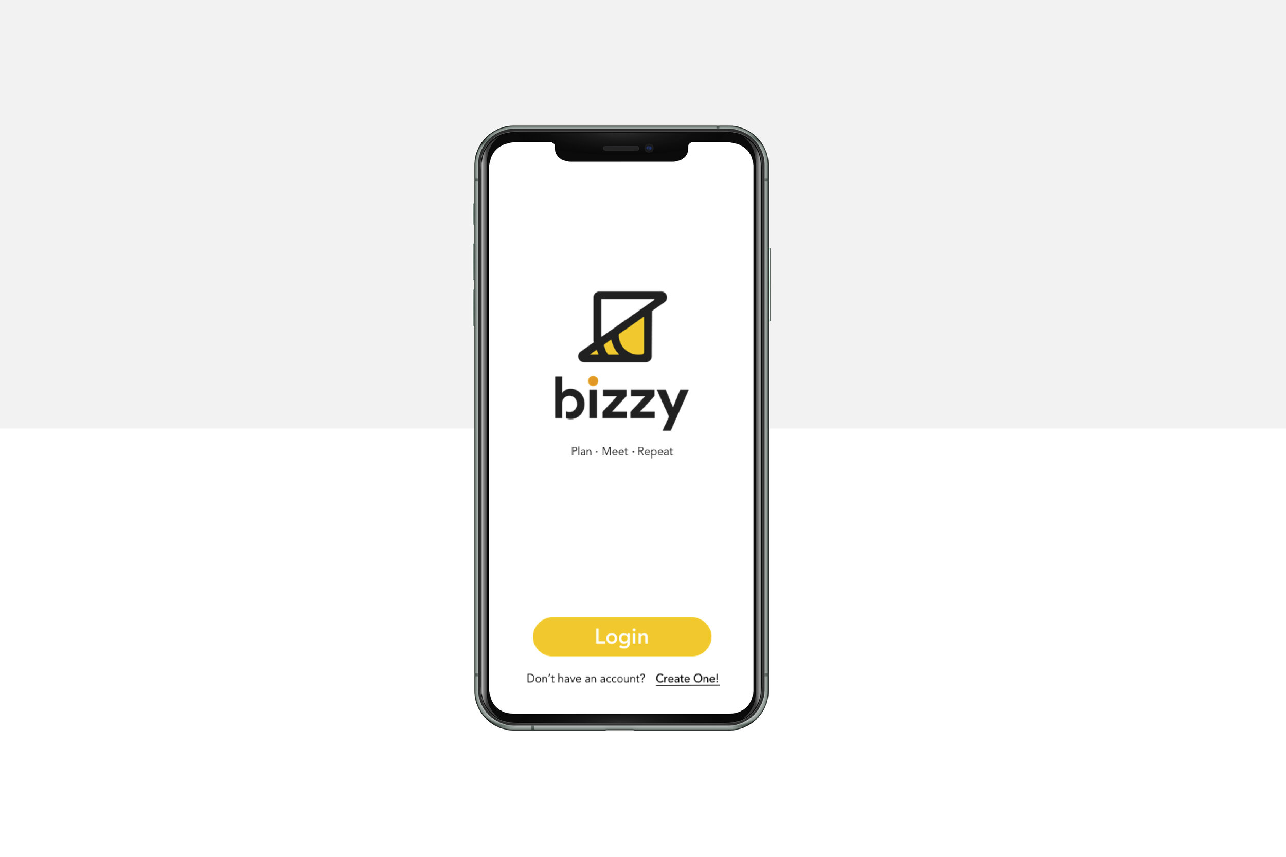
Here we see the homepages from the current app and our new redesign.
The new facelift gives the app a simple, clean and modern feel.
In the tab navigation, we made sure that our terminology is consistent throughout the app. By doing so, users can associate and remember what each function is and does. We decided to rename spark to ideas so it’s more intuitive for users. However, we wanted to include the lighten in the icon design because we really liked what spark meant to bizzy. Which is sparking an idea for yourself or with friends.
We also introduced the chat, notification and profile function to the tab navigation.

We made sure to include the ability of editing any current events or ideas. In the current app, the user would have to delete the buzz if he or she would like to make any changes.
While we were conducting our c&c analysis, we came across a feature where it displayed the weather and distance of where the user is going.
During our low fidelity usability testing, we implemented these functions and received positive feedback. Users thought it was convenient to have these features so that they can plan their trip more easily.

Clickable Prototype
Next Steps
The current iteration of the prototype can always be expanded and continue to grow. With more resources, we would like to create even more functionality within the app.
Short term:
First, building out the notification and profile page. Notifications should be more detailed, it’s important to show details when the user receives it. As for the profile page, it is important to let users choose their privacy as to what they want to display on their profile.
Secondly, the option to choose who to sync from their contact list. Many people were hesitant when they had sync their full contact list.
Third, including onboarding instructions for the profile page. By doing so, users will be reminded to fill out their profile page.
Lastly, the ability to not only chat in groups from events/ideas but to chat with people one on one.
Long term:
Building out a payment function where users can send or receive payments within an event they create.