
Sage
UX UI Design Project
The Brief
Design a third-party mobile app to help underrepresented creatives access hiring opportunities, showcases, communities, and/or other resources that ultimately empower them and allow them to thrive.
The Background
Adobe Creative Jam and General Assembly students across the United States, United Kingdom, and Canada come together in a designathon to create solutions that matter. Adobe Creative Jams gave all participants of their hackathon 70 hours to create a high fidelity prototype of a native app.
The Problem
Creating a third-party mobile app to help underrepresented creatives and also stand out among the other 400 competitors in the hackathon.
The Solution
SAGE - a mobile app designed for creatives seeking to mentor BIPOC creatives in any stage of their career.
Project Info
Team: Dana Chen (Me), Danielle Nedivi, and Kevin Perez
My Role: Logo Design, Color Palette, Landing Screen, Messaging, Resume, and Portfolio Feature UI
Danielle’s Role: Mentor Profile, Notifications, and Settings UI
Kevin’s Role: Navigation Bar, Onboarding, Mentee Profile, Mentee Pool, and Search UI
Team Effort: Lofi Wireframes, Mid Wireframes, High Fidelity Prototype, Persona
Tools: Adobe XD and Illustrator
Platform: iOS App
Timeline: 70 Hours
UX Process - Double Diamond

With little time we had on our hands, we still kept in mind the Double Diamond throughout our UX design process
With limited time, we quickly did our research where we discovered current trends and then came together to synthesize our findings. Within 70 hours, we created a high fidelity prototype of a native app based on preliminary sketches and medium fidelity wireframes that incorporated simple user flows, easy-to-use features, and unique logo and branding.
Step 1: Research
Discover
We started off the project by going our separate ways and doing our own market research. We would then come together, and synthesize what we found during our quick two hour process.
I begin mine with a quick comparative and competitive analysis. By looking at the current market, it provided insights that allowed me to see what the current standards are and the popular features.
I compared the following:
LinkedIn
ADPList
Designed
I noticed that they all had common features, but no one had everything. With this, I kept in mind the features that I thought could make our app stand out.
Define
We came together and discussed what features our app would have. We then assessed the feasibility and constraints that would be working with and against us. Out of the collaborative brainstorm, we agreed to design an app that had:
mentor and mentee profiles
a dashboard
a messaging feature
a search feature
a notification feature
a profile/account feature
We felt these features would be the most essential in creating an intuitive and useful mentoring app that would have the most potential to impact and promote underrepresented creatives in the digital creative world.

Persona
I wish I could say we had the time to find a photo for Jamie, or do a Meyer Briggs test, and found brands that would resonate with out potential users.
But we didn’t.
With 68 hours remaining, we boiled down who our target user was by asking who, what, and why.
These simple questions would guide our journey to the end, The Sage App.

Step 2: Design
Design Studio | Sketching
Before we got into sketching, we did a quick design studio where we were able to explore a wide set of ideas and create a shared vision to move forward. Taking all the ideas, we began sketching out our low-fidelity mock-ups. We settled on the following elements:
a bottom navigation
messaging icon on the top right
status: online/offline
continuance of simple user flows
With the time constraint, we admittedly did not think through every nuance of each feature we needed to create.
We quickly moved on to our mid-fidelity mock-ups where it gave more shape and functionality to our design. It was enough to do some quick usability testing before we jumped into the high-fidelity designs.

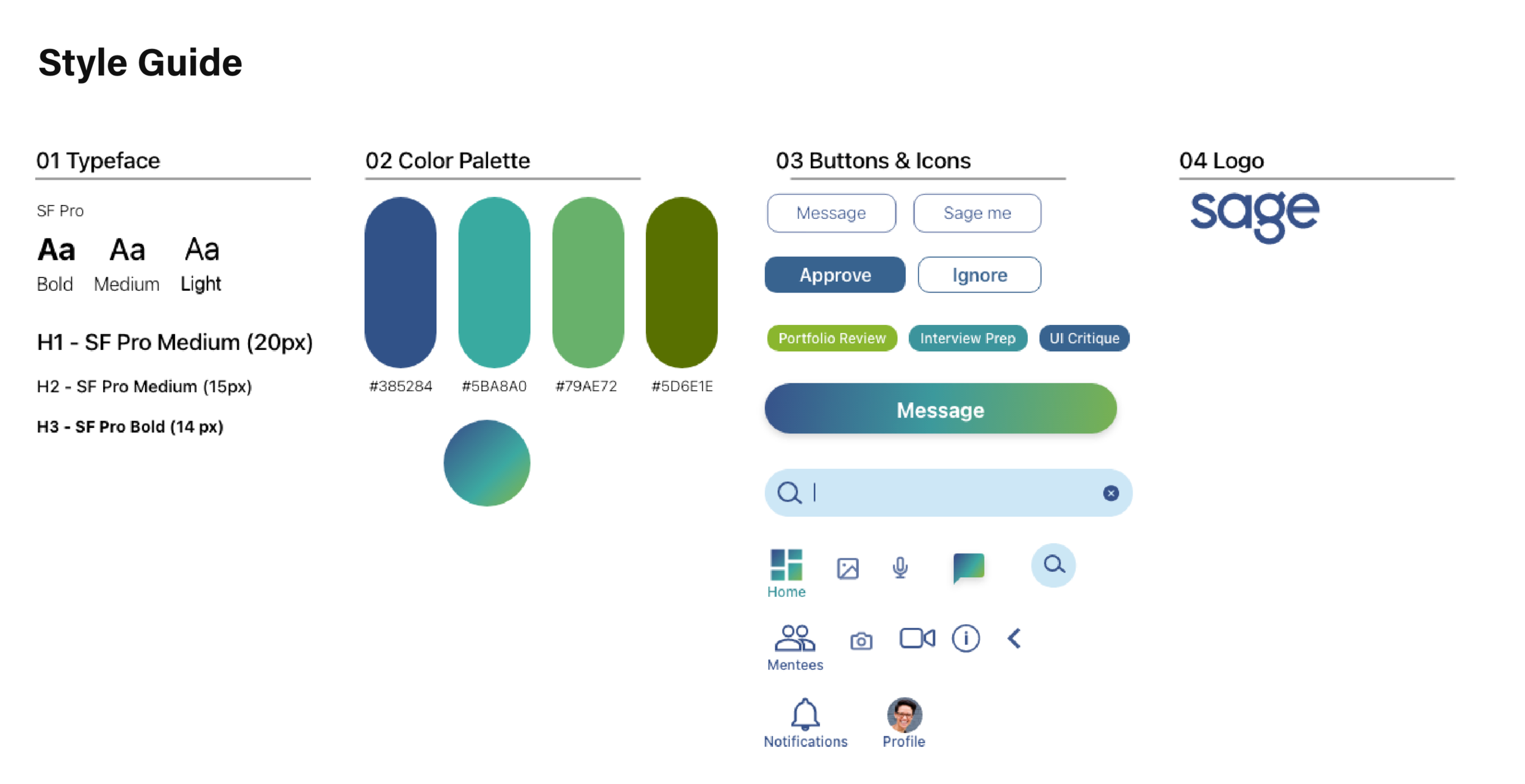
Style Guide
I was given the task to create the sage logo and come up with a color palette for the app. I decided to go with a font that could convey a sense of symmetry, simplicity, yet a uniqueness to the users. As for the resulting color palette, it relies heavily on blue and green. I choose green because it portrays an opportunity for fresh starts, security, and it relaxes the mind. Whereas, blue offers a sense of confidence, professionalism, and the feeling of trust. However, with the gradient we use, we found it a way to keep the app modern and youthful.
The Sage App
During the process of designing our high-fidelity mockup, we were looking for a balance in our UI. With our medium-fidelity wireframes and a color palette, we resisted the urge to overwhelm users with over stimulating color-contrasting UI elements. Instead, we found ways to introduce classic UI components with enough colors and hierarchical elements to keep our design aesthetically clean and simple.


Final Results
Close to 400 individuals participated in this contest to design a third-party mobile app to help underrepresented creatives. Our team made it to the top 5 finalist round of the competition.
Next Steps
Though it was gratifying, we did see room for improvement in our app. The next steps to improve our app would include doing more user testing and collaboration with developers and creatives. Additionally, thinking through all user flows for mentees would ensure we are providing the proper features for both mentors and mentees to have meaningful and productive mentorships. And finally, finding design solutions that allow for scaling of this app to ultimately lift and promote all BIPOC creatives.
Project Credits
Dana Chen: logo, color palette, landing screen, messaging, resume, and portfolio feature UI
Danielle Nedivi: mentor profile, notifications, and settings UI
Kevin Perez: Navigation bar, onboarding, mentee profile, mentee pool, and search UI
Low-fidelity mockups: Dana Chen, Danielle Nedivi, Kevin Perez
Mid-fidelity mockups: Dana Chen, Danielle Nedivi, Kevin Perez
Persona: Dana Chen, Danielle Nedivi, Kevin Perez